
How it works
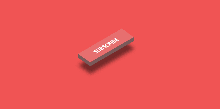
The button uses a skew and rotate transform for the main face, while ::before and ::after create the left side and bottom edge. The hover state moves the face and expands its shadow to make the layer separation look deeper.
Example
Change the face and side measurements consistently. If you set the width to 180px, update the bottom pseudo-element width and the hover translation so the geometry remains aligned.
HTML & CSS:
1
2
3
4
5
6
7
8
9
10
11
12
13
14
15
16
17
18
19
20
21
22
23
24
25
26
27
28
29
30
31
32
33
34
35
36
37
38
39
40
41
42
43
44
45
46
47
48
49
50
51
52
53
54
55
56
57
58
59
<style>
    *{
    margin: 0;
    padding: 0;
    }
    .main{
        width: 100%;
        height: 100vh;
        display: flex;
        justify-content: center;
        align-items: center;
        background: #f05454;
    }
    .btn{
        width: 150px;
        height: 40px;
        font-size: 1.1rem;
        font-weight: 700;
        font-family: 'Gill Sans', 'Gill Sans MT', Calibri, 'Trebuchet MS', sans-serif;
        cursor: pointer;
        outline: none;
        border: none;
        transform: rotate(-30deg) skewX(25deg) translate(0,0);
        box-shadow: -10px 10px 10px rgba(0, 0, 0, 0.5);
        background: #e76f6f;
        color: white;
        transition: all 0.4s;
        position: relative;
    }
    .btn::before{
        content: '';
        position: absolute;
        top: 5px;
        left: -10px;
        width: 10px;
        height: 100%;
        background: #795a5a;
        transform: rotate(0deg) skewY(-45deg);
    }
    .btn::after{
        content: '';
        position: absolute;
        top: 40px;
        left: -5px;
        width: 150px;
        height: 10px;
        background: #795a5a;
        transform: rotate(0deg) skewX(-45deg);
    }
    .btn:hover{
        transform: rotate(-30deg) skewX(25deg) translate(20px,-20px);
        box-shadow: -30px 30px 10px rgba(0, 0, 0, 0.5);
    }
</style>

<div class="main">
    <button class="btn">SUBSCRIBE</button>
</div>
Expected output
A red subscribe button appears at the center of a red stage. Hovering pushes the button toward the viewer and enlarges the offset shadow.