
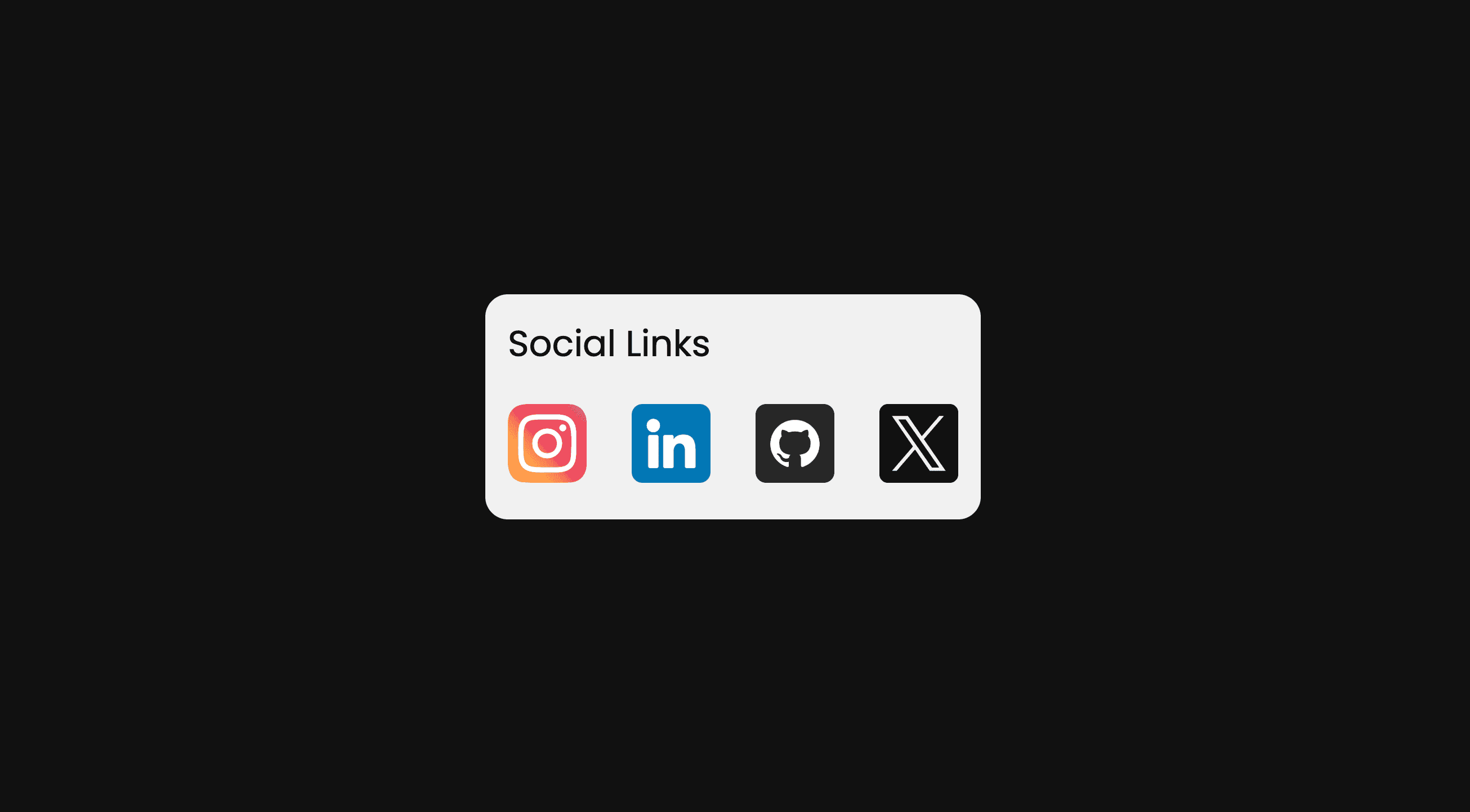
How it works
Each social link sits immediately before its matching follower panel, so the adjacent-sibling selector reveals the right count. The panel is positioned over the card and starts transparent; hovering or focusing a link moves it down and fades it in. The card provides the positioning context. Each link also needs visible text, which serves as a lightweight icon without relying on missing image files.
Example
Replace the demo profile URLs and sample counts with your own. Keep every .followers element immediately after its link or the adjacent-sibling selector will no longer match. The labels (IG, in, GH, X) are deliberately text-based; replace them with local SVGs if you want branded icons. Keyboard focus triggers the same reveal as hover.
HTML & CSS:
1
2
3
4
5
6
7
8
9
10
11
12
13
14
15
16
17
18
19
20
21
22
23
24
25
26
27
28
29
30
31
32
33
34
35
36
37
38
39
40
41
42
43
44
45
46
47
48
49
50
51
52
53
54
55
56
57
58
59
60
61
62
63
64
65
66
67
68
69
70
71
72
73
74
75
76
77
78
79
80
81
82
83
84
85
86
87
88
89
90
91
92
93
94
95
96
97
98
99
100
101
102
103
104
105
106
<style>
    @import url('https://fonts.googleapis.com/css2?family=Poppins&display=swap');

    * {
        margin: 0;
        padding: 0;
        box-sizing: border-box;
    }

    body {
        background: #121212;
        font-family: "Poppins", sans-serif;
    }

    .container {
        display: flex;
        justify-content: center;
        align-items: center;
        height: 100vh;
    }

    .social-links {
        position: relative;
    }

    .social-links .social-links-inner {
        background: #f1f1f1;
        padding: 10px;
        border-radius: 10px;
    }

    .social-links .social-links-inner .links {
        display: flex;
        gap: 20px;
    }

    .social-links .social-links-inner .followers {
        position: absolute;
        display: flex;
        justify-content: center;
        align-items: end;
        color: #fff;
        z-index: -1;
        top: 0;
        left: 0;
        width: 100%;
        height: 100%;
        border-radius: 10px;
        padding: 5px 0;
        opacity: 0;
        transition: all 0.4s;
    }

    .social-links .social-links-inner .title {
        width: 100%;
        margin-bottom: 15px;
    }

    .social-links a {
        display: grid;
        place-items: center;
        width: 35px;
        height: 35px;
        border-radius: 50%;
        color: #fff;
        font-size: 12px;
        font-weight: 700;
        text-decoration: none;
    }

    .social-links a:hover,
    .social-links a:focus-visible {
        transition: all 0.4s;
        transform: scale(1.1) rotate(-10deg);
    }

    .social-links a:focus-visible {
        outline: 2px solid #121212;
        outline-offset: 2px;
    }

    .social-links a:hover + .followers,
    .social-links a:focus-visible + .followers {
        transform: translateY(32px);
        opacity: 1;
    }
</style>

<div class="container">
    <div class="social-links">
        <div class="social-links-inner">
            <p class="title">Social Links</p>
            <div class="links">
                <a href="https://www.instagram.com/" target="_blank" rel="noopener noreferrer" aria-label="Instagram" style="background: #d13c99;">IG</a>
                <div class="followers" style="background: #d13c99;">100k Followers</div>
                <a href="https://www.linkedin.com/" target="_blank" rel="noopener noreferrer" aria-label="LinkedIn" style="background: #0177B5;">in</a>
                <div class="followers" style="background: #0177B5;">50k Followers</div>
                <a href="https://github.com/" target="_blank" rel="noopener noreferrer" aria-label="GitHub" style="background: #262626;">GH</a>
                <div class="followers" style="background: #262626;">5 Followers</div>
                <a href="https://x.com/" target="_blank" rel="noopener noreferrer" aria-label="X" style="background: #000000;">X</a>
                <div class="followers" style="background: #000000;">100 Followers</div>
            </div>
        </div>
    </div>
</div>
Expected output
A centered card shows four round social labels. Hovering or tabbing to one reveals its corresponding colored sample follower count below the card.