
How it works
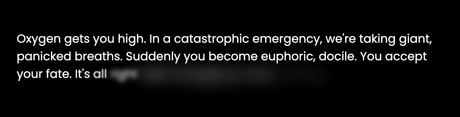
The paragraph is split into words, and each word is appended inside a span after a delay based on its array position. CSS blur and opacity animations run whenever a new span appears.
Example
Change the 150ms delay to 80ms for a faster reveal, or replace paragraph text with a short heading for a tighter animation.
HTML & CSS:
1
2
3
4
5
6
7
8
9
10
11
12
13
14
15
16
17
18
19
20
21
22
23
24
25
26
27
28
29
30
31
32
33
34
35
36
37
38
<style>
    @import url('https://fonts.googleapis.com/css2?family=Poppins:ital,wght@0,100;0,200;0,300;0,400;0,500;0,600;0,700;0,800;0,900;1,100;1,200;1,300;1,400;1,500;1,600;1,700;1,800;1,900&display=swap');

        * {
            margin: 0;
            padding: 0;
        }

        body {
            background: black;
            color: white;
            padding: 50px;
            font-family: "Poppins", sans-serif;
        }

        p span {
            opacity: 1;
            animation: animateSpan 1s;
        }

        @keyframes animateSpan {
            0% {
                opacity: 0;
                filter: blur(11px);
            }
            50% {
                opacity: 1;
                filter: blur(11px);
            }
            100% {
                opacity: 1;
                filter: blur(0px);
            }
        }
</style>

<p id="para"></p>
JS Code:
1
const paragraph = 'Small details make interfaces feel intentional. Build one word at a time, give every word room to breathe, and let the final result feel effortless.'; function animateText(element, content) { const contentArr = content.split(' '); contentArr.forEach((text, index) => { setTimeout(() => { const span = document.createElement("span"); span.innerText = `${text} `; element.appendChild(span); }, index * 150); }); } const paraElm = document.querySelector('#para'); animateText(paraElm, paragraph);Expected output
Words appear one at a time in the center of the dark stage. Each word briefly blurs before settling into full opacity.